BRAND IDENTITY
PACKAGING DESIGN
GYMBEAM
GymBeam is the No.1sports nutrition brand in Europe, growing fast in a crowded e-commerce market. That pace called for a brand system that stays recognisable everywhere it shows up, from shelf to screen to community.
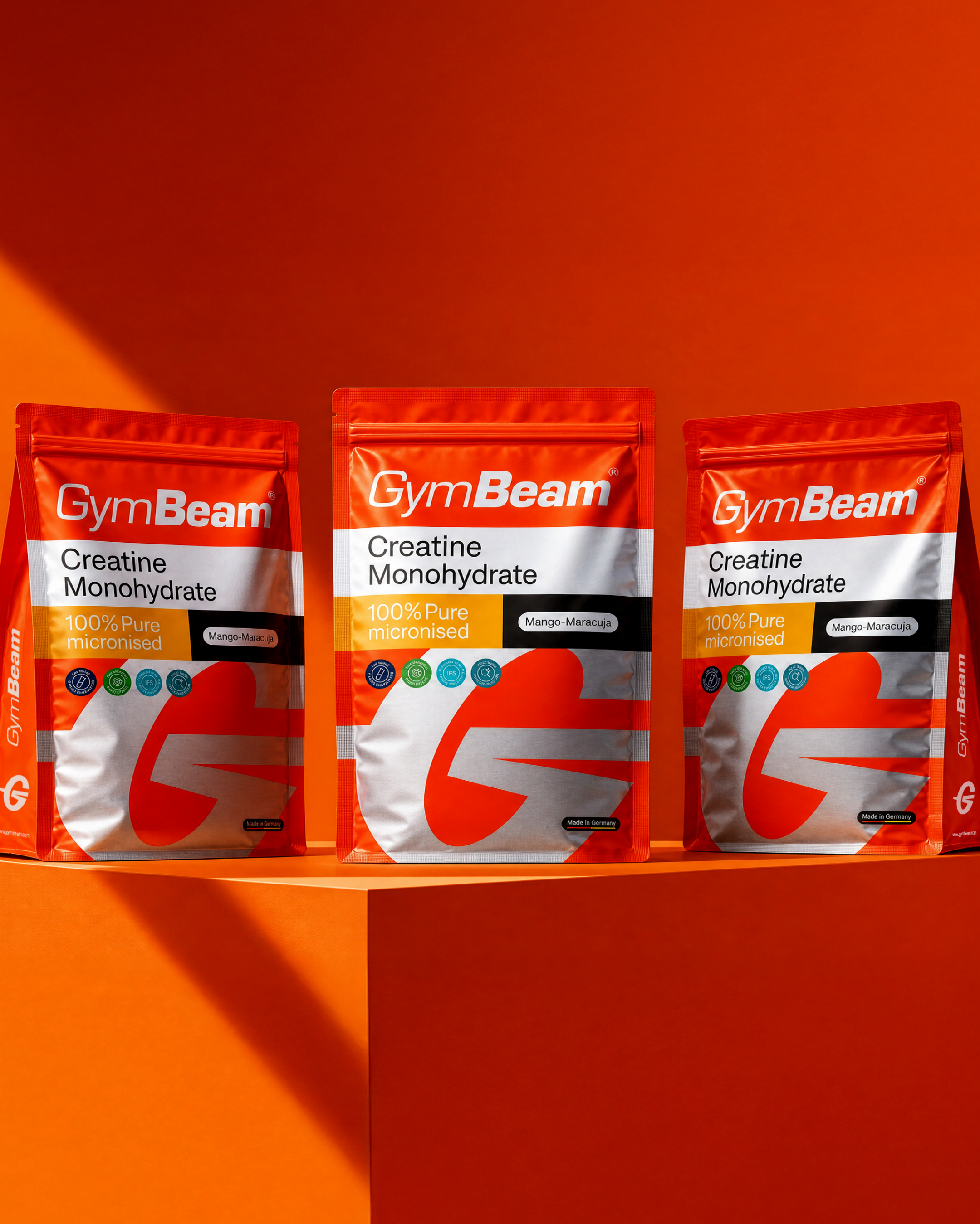
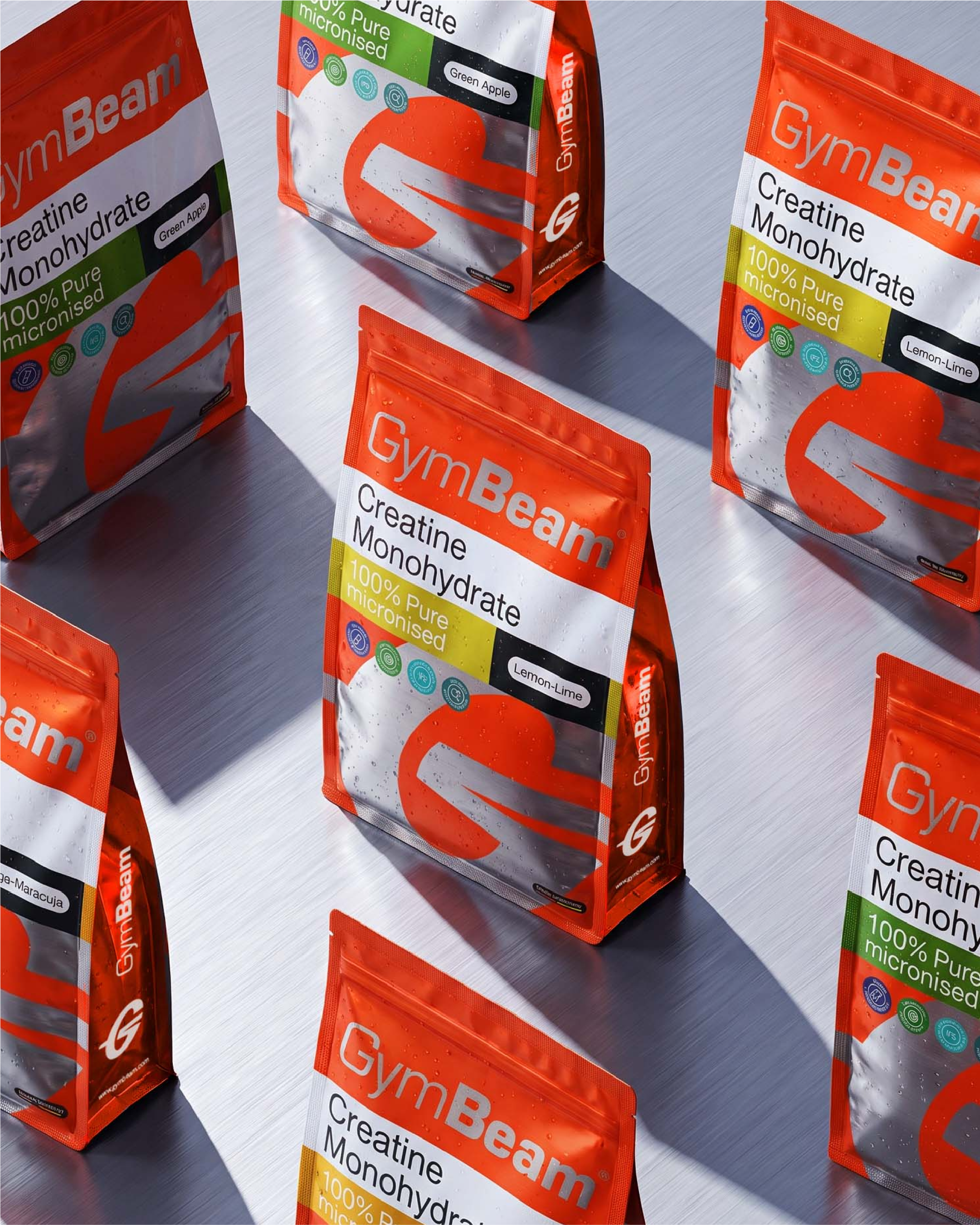
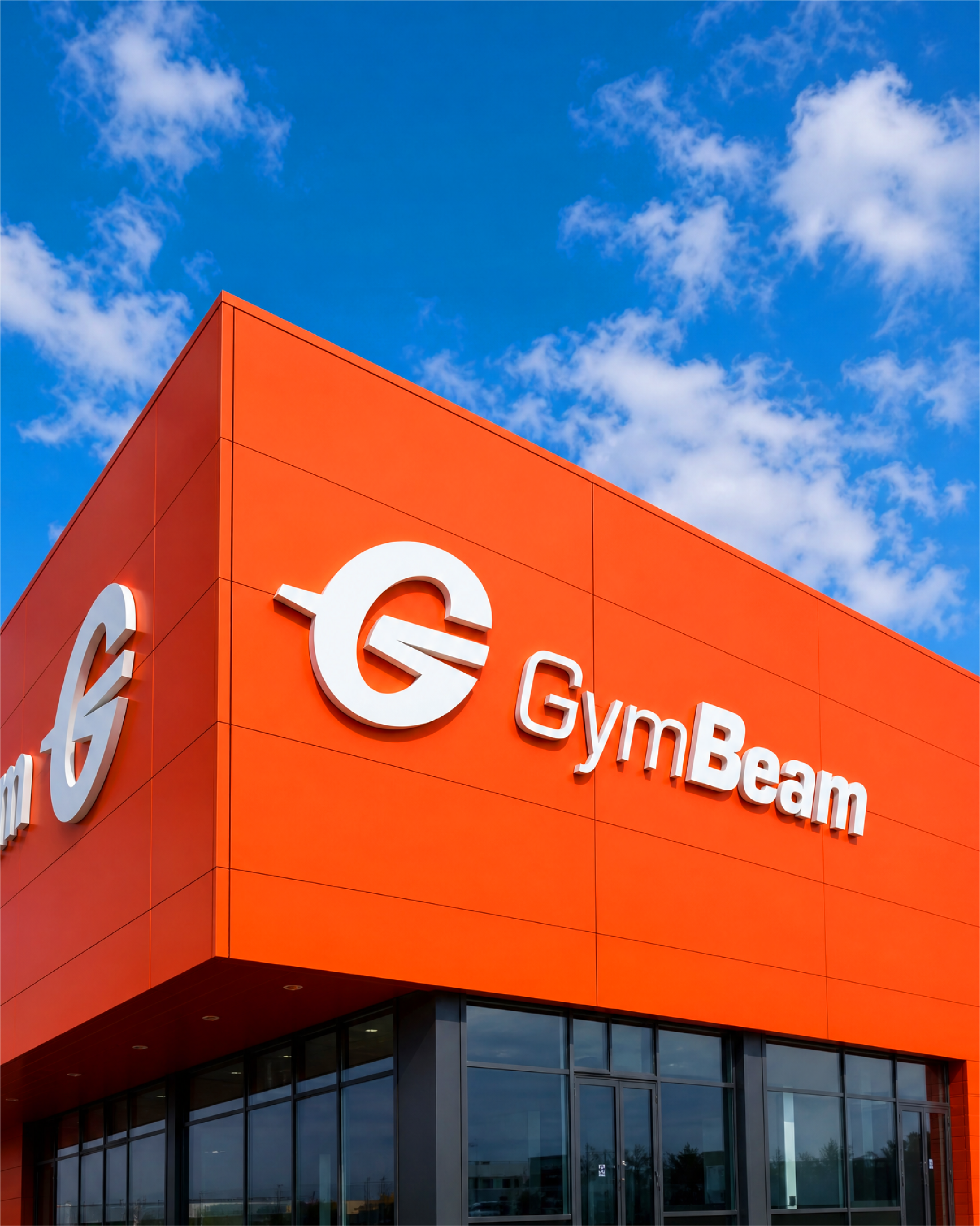
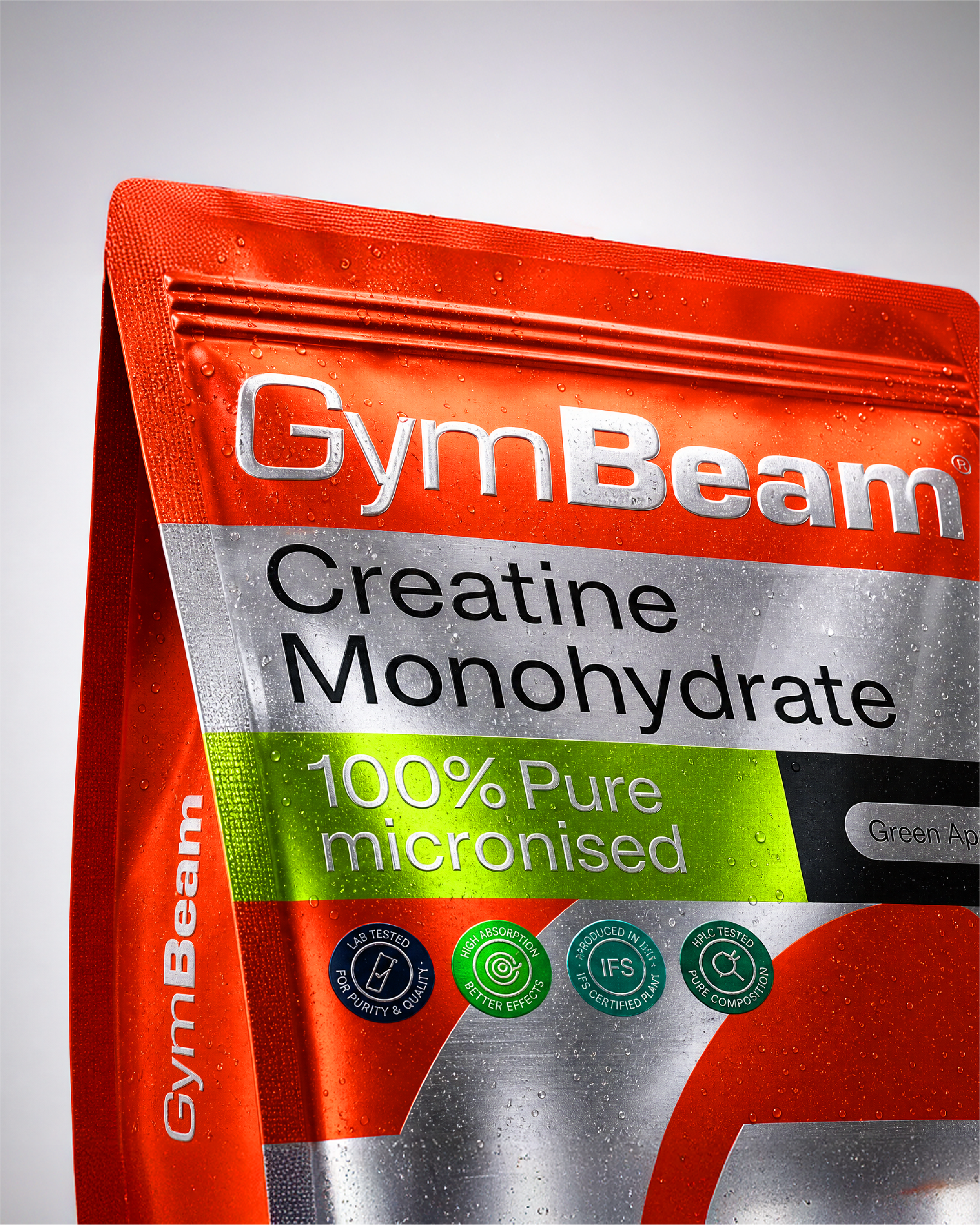
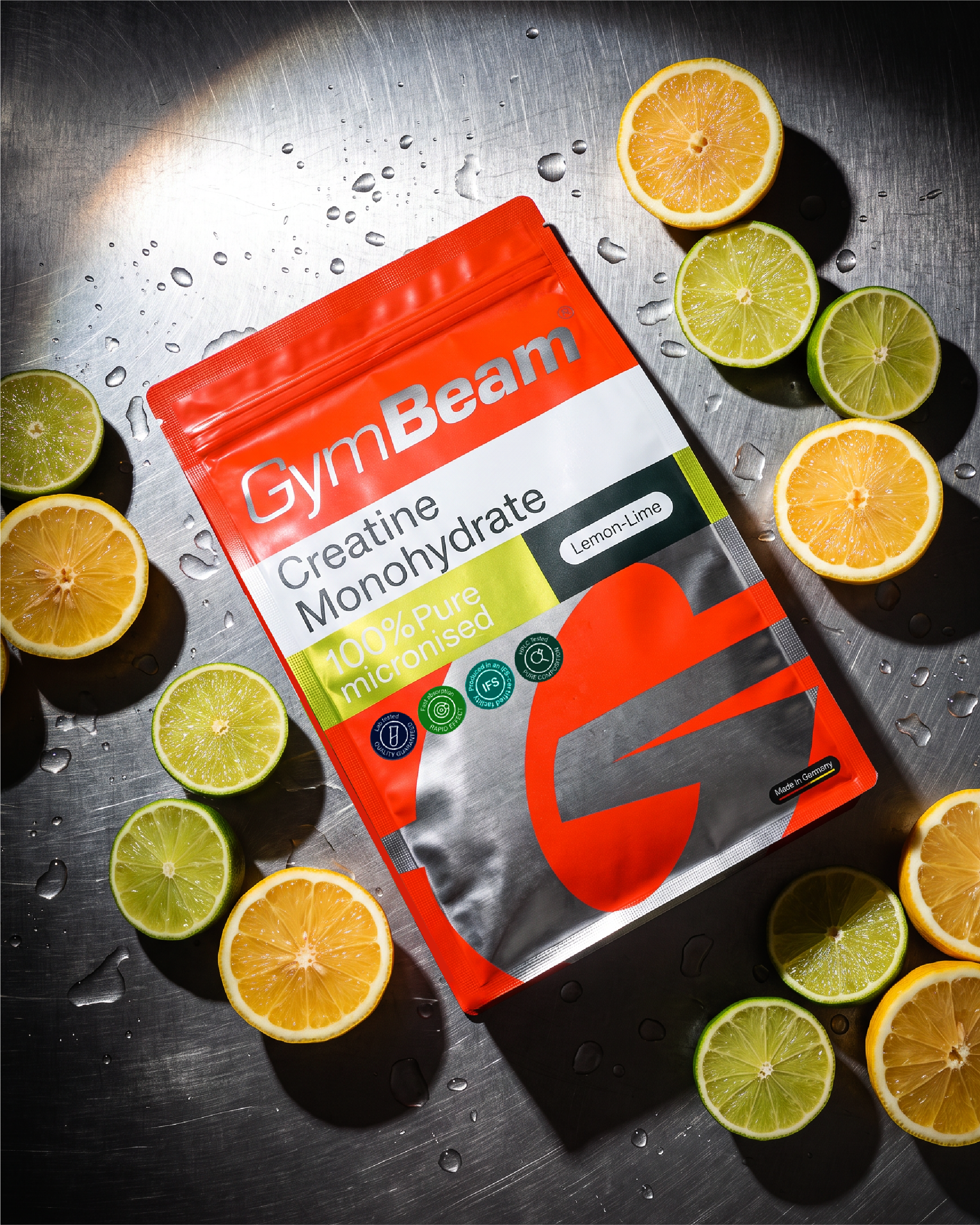
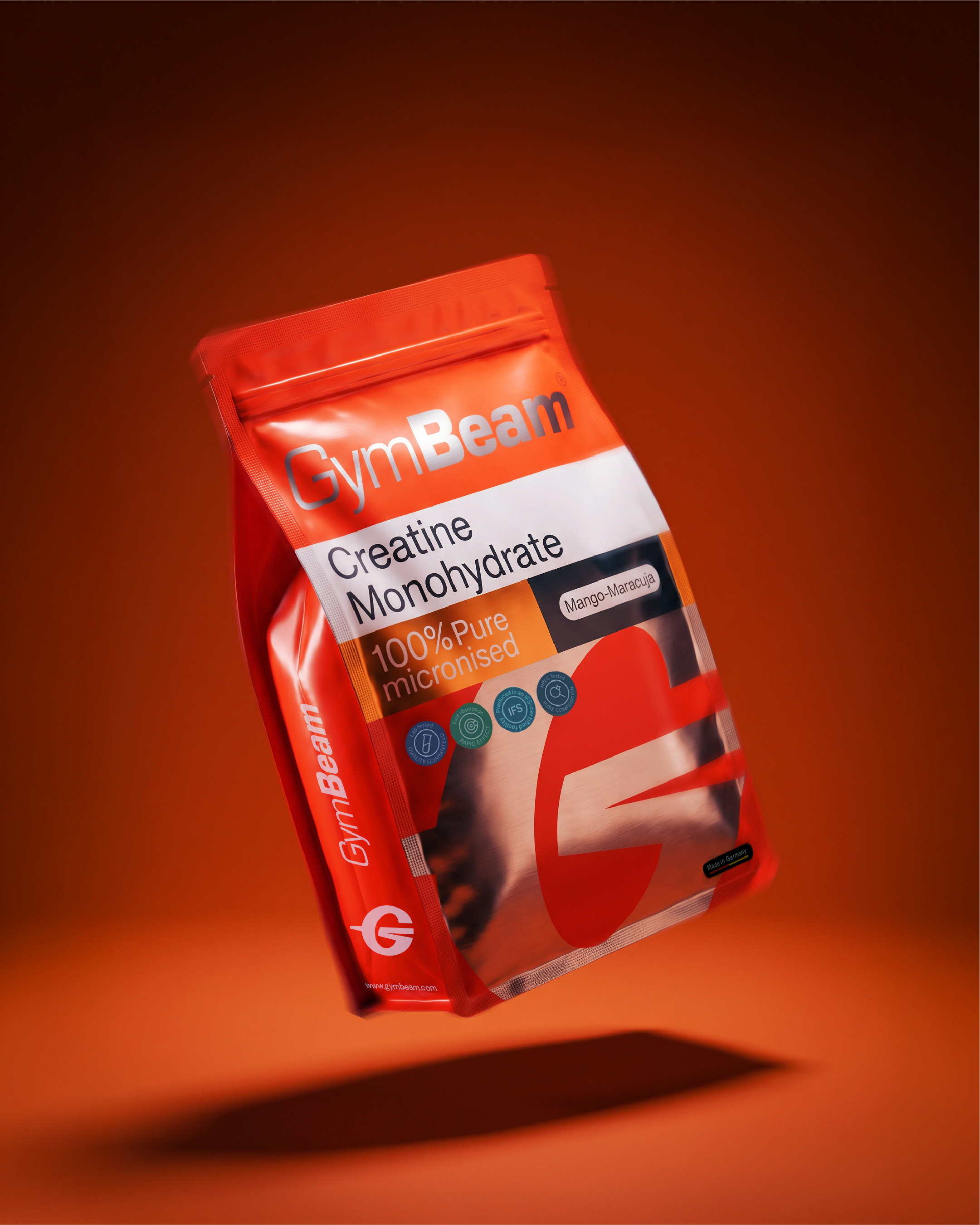
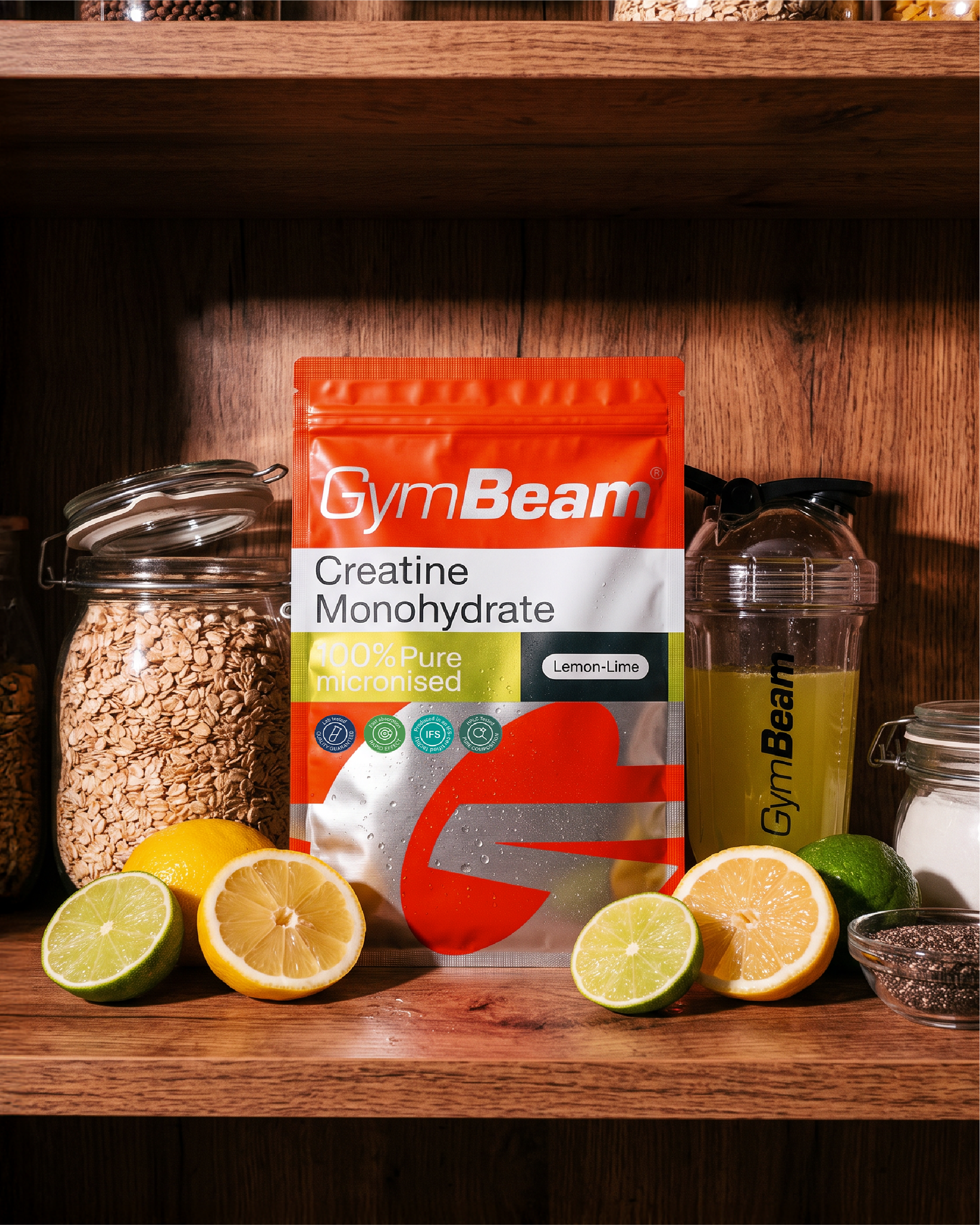
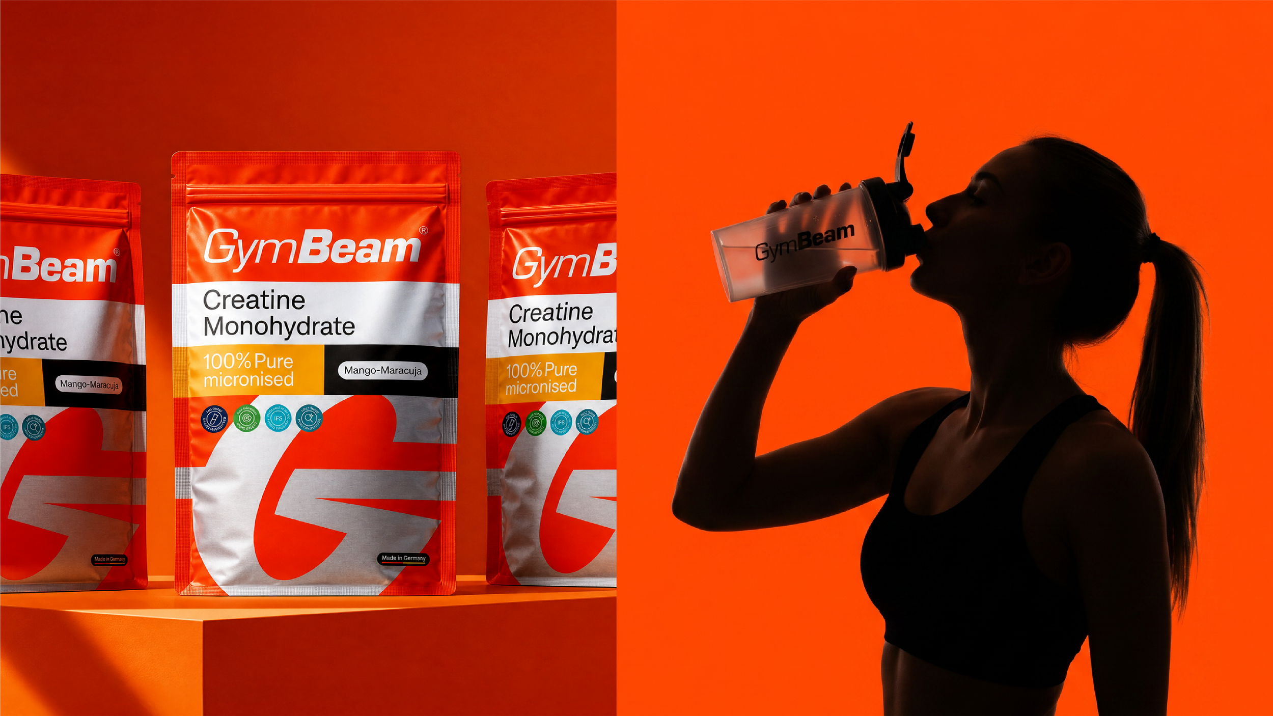
At the centre sits the GymBeam 'G', shaped into a flexible visual device that drives layouts, patterns and movement across the whole brand. More than a symbol, the 'G' ties communication, packaging, digital spaces and sonic branding into one coherent identity that holds up at every scale. The packaging starts with the creatine pouches, built on a bright orange base and a large, confident 'G' that anchors the line and gives it strong shelf impact through high contrast, simple structure and a clear typographic hierarchy.
The result is a unified ecosystem made for modern attention spans, maximising the recognition and consistency GymBeam needs to keep growing globally.
Designed at GoBIGNAME.