VISUAL IDENTITY
PACKAGING DESIGN
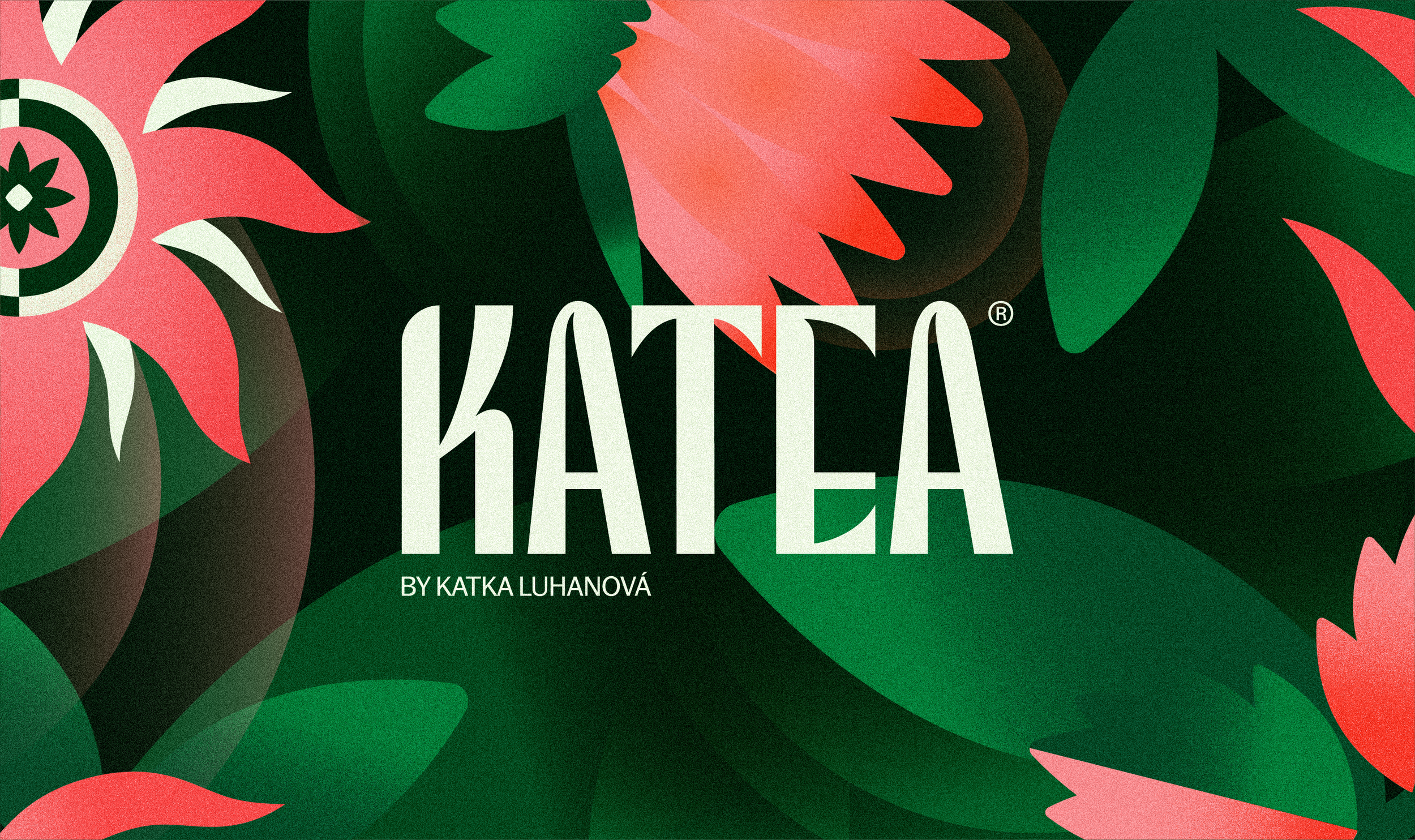
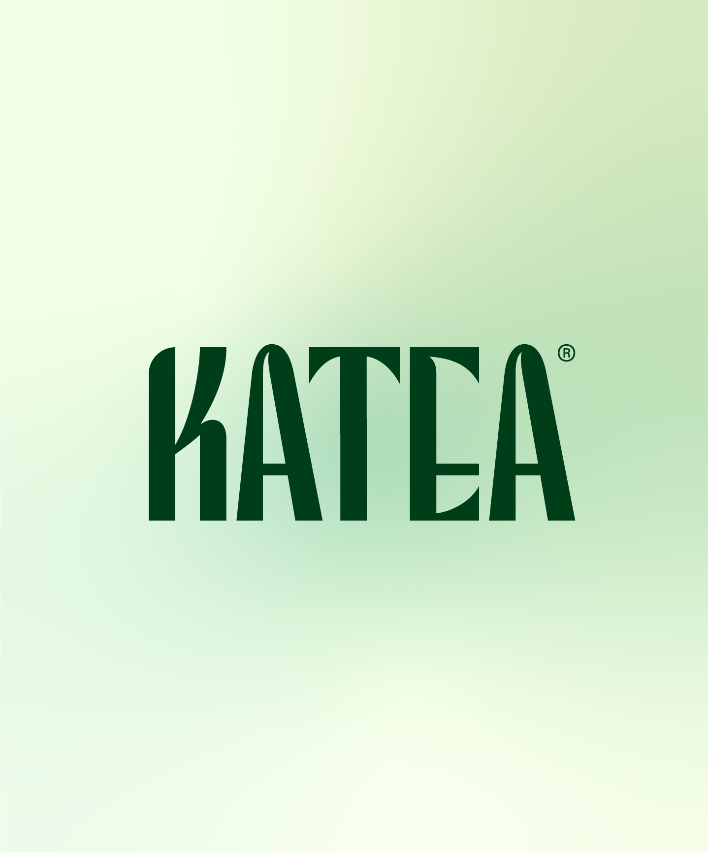
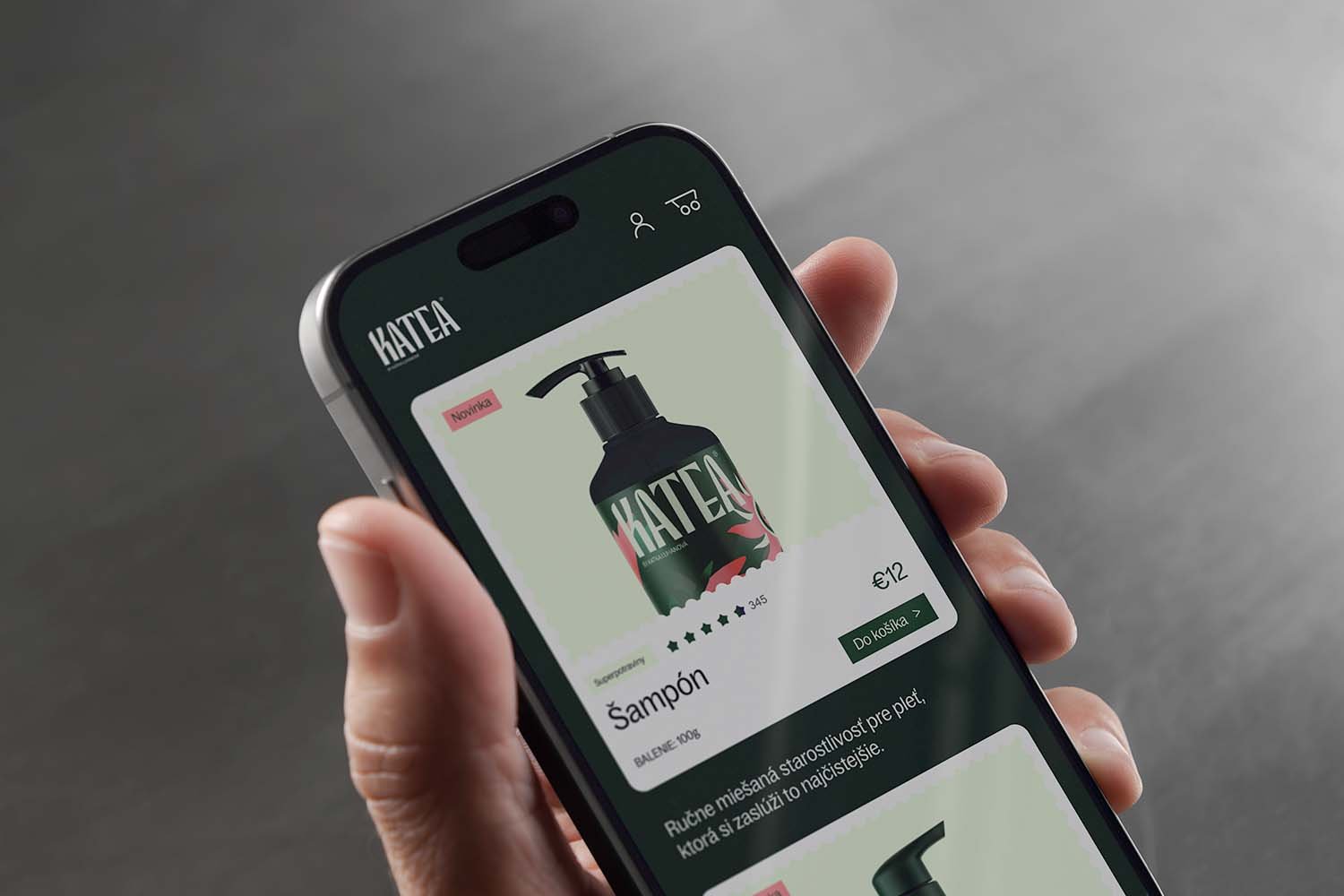
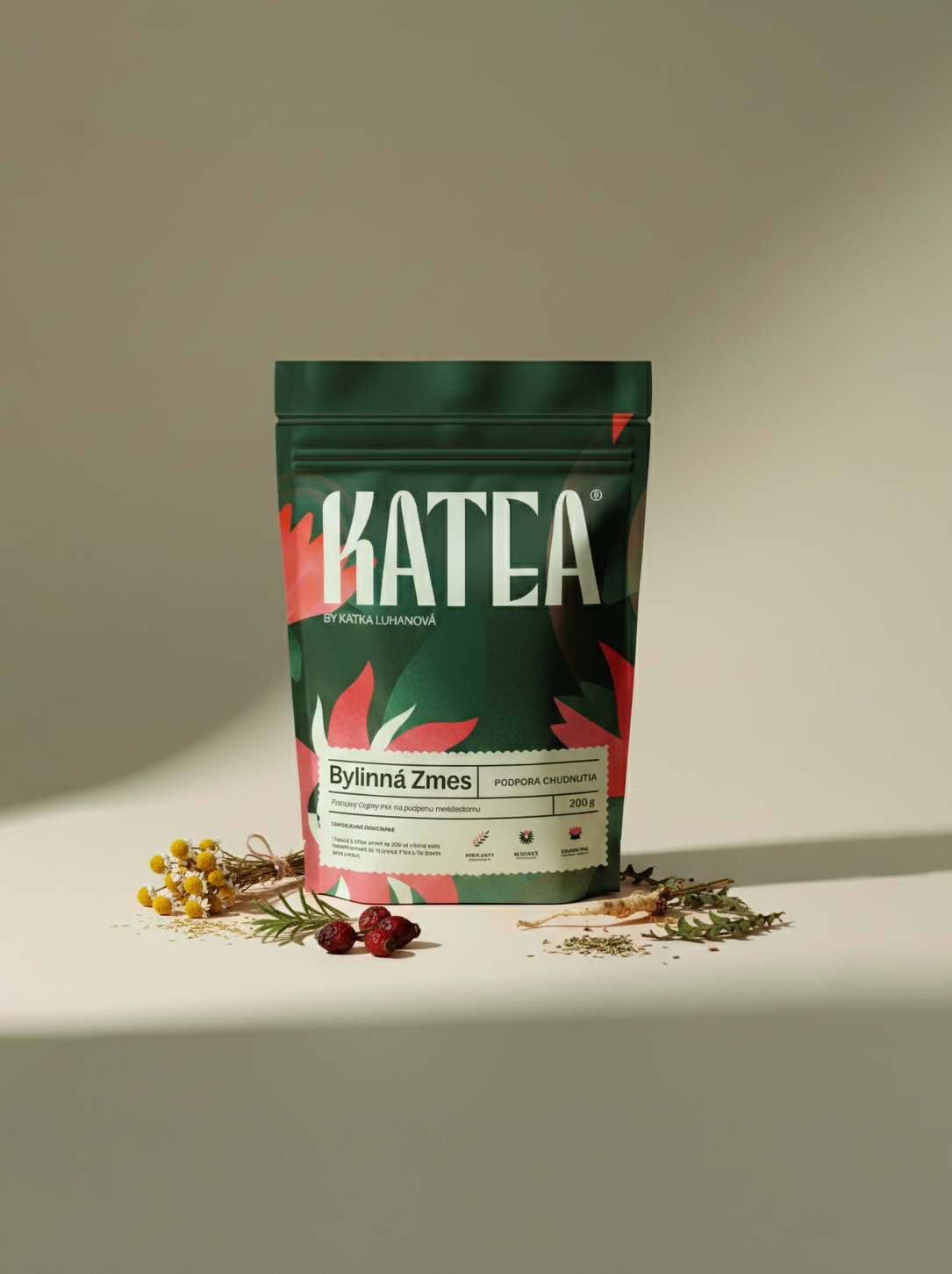
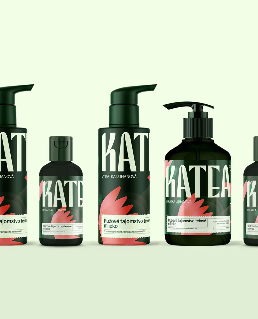
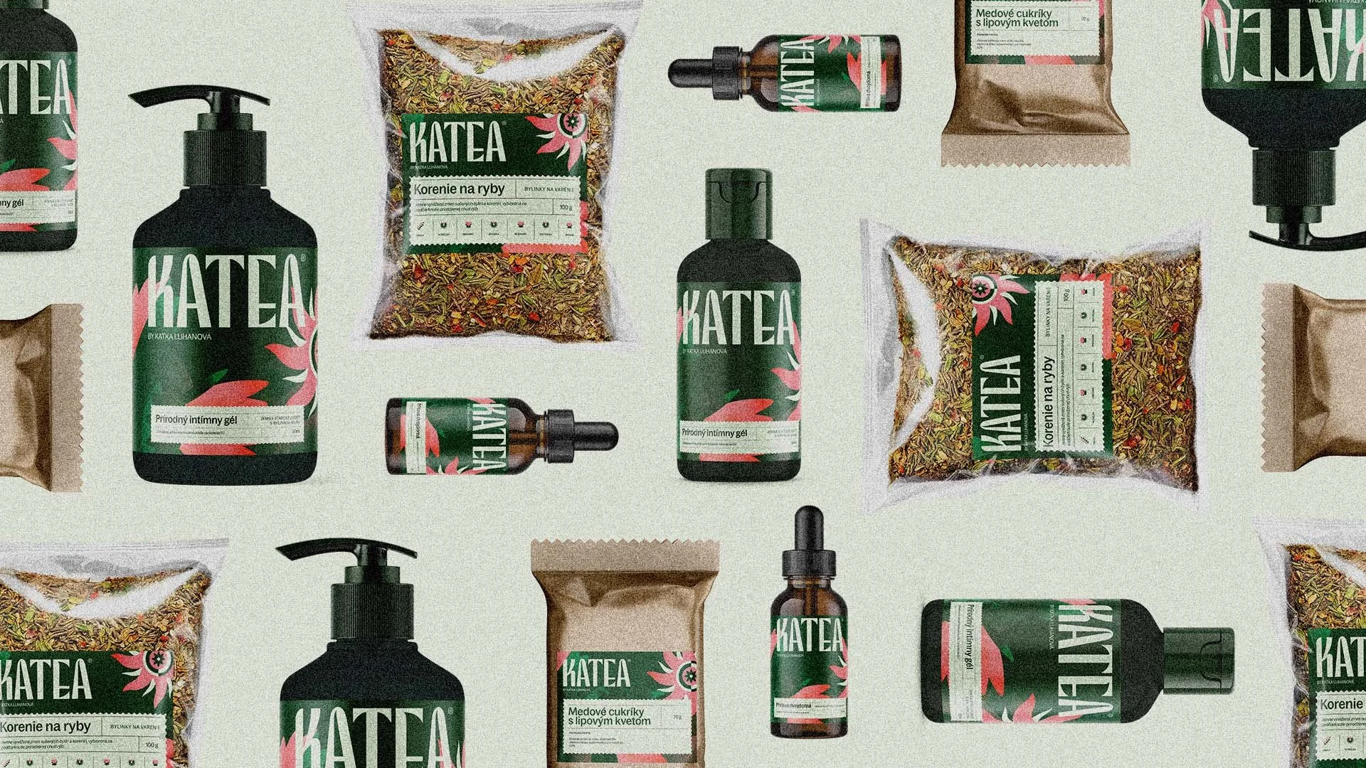
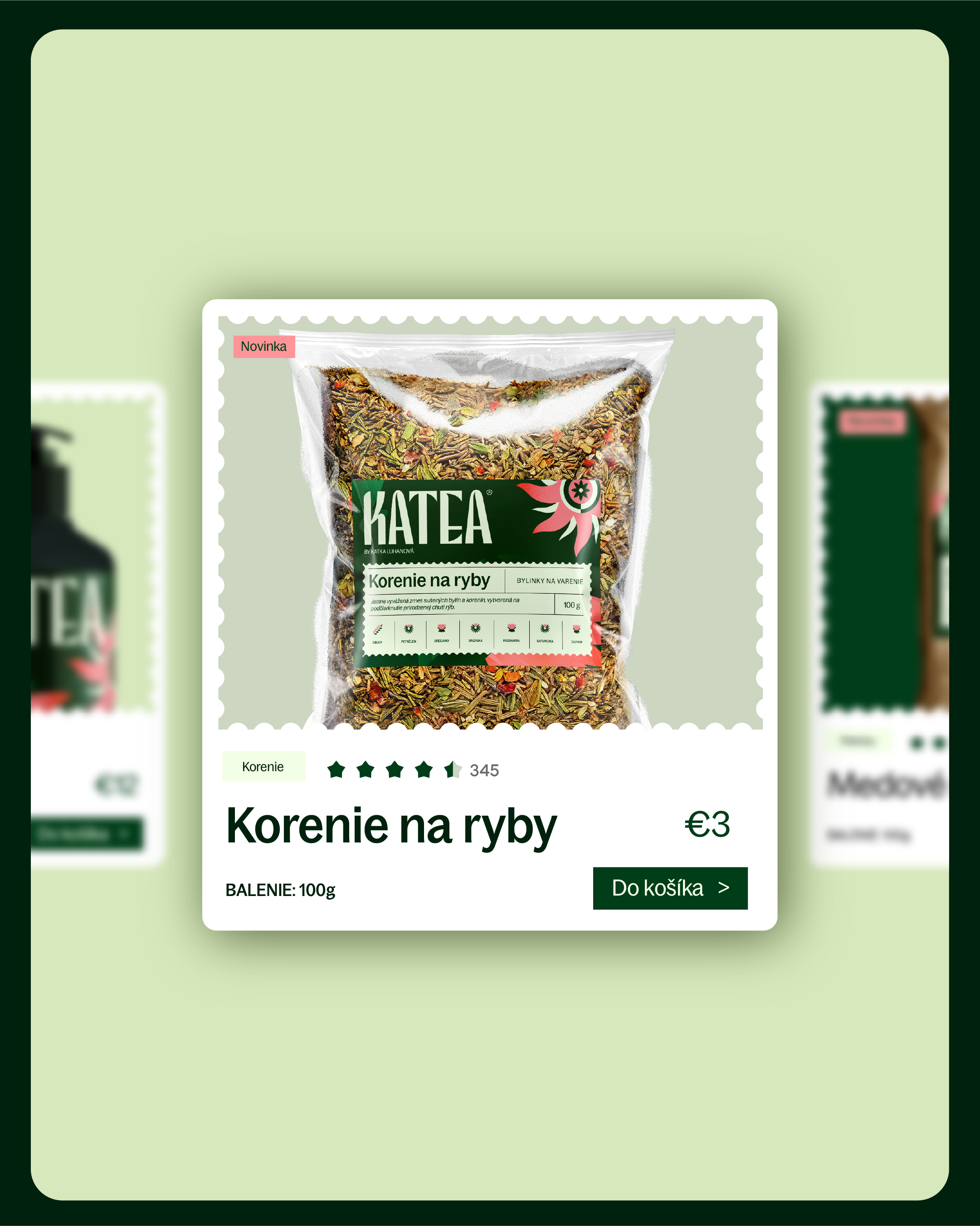
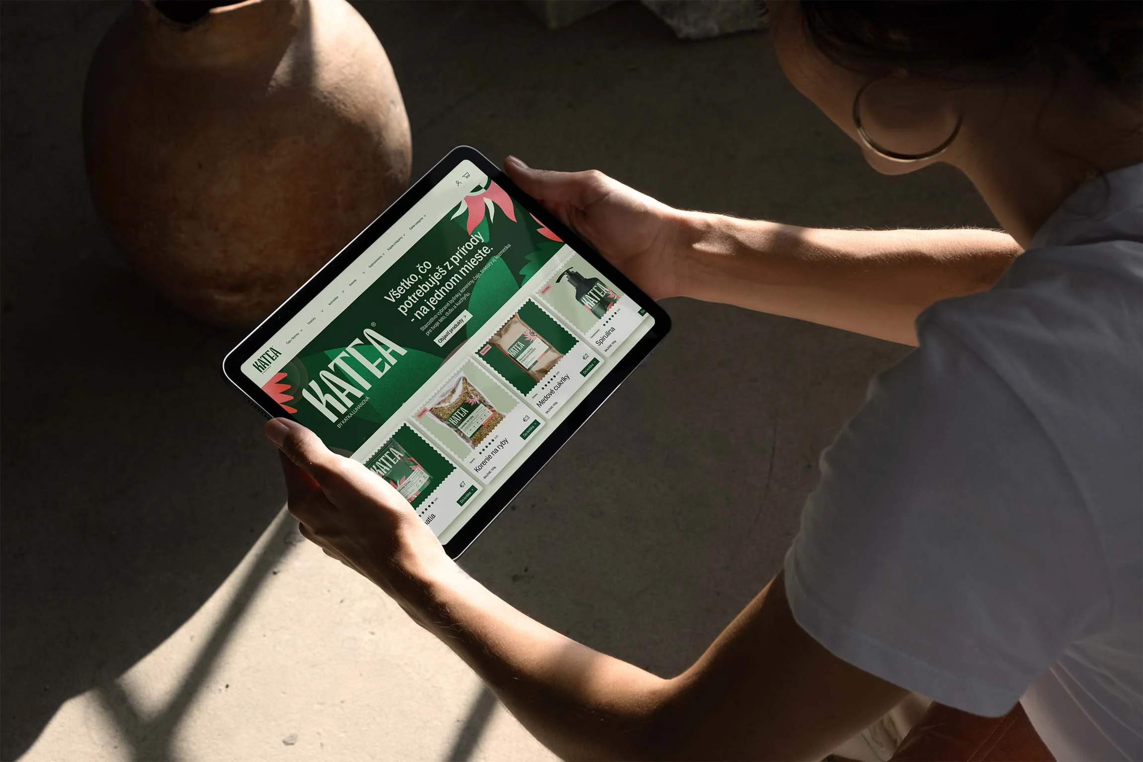
KATEA
What do we do when the packaging is limited to sticker labels?
We just make a huge logo.
For Katea, we wanted an identity that feels as alive as the herbs inside.
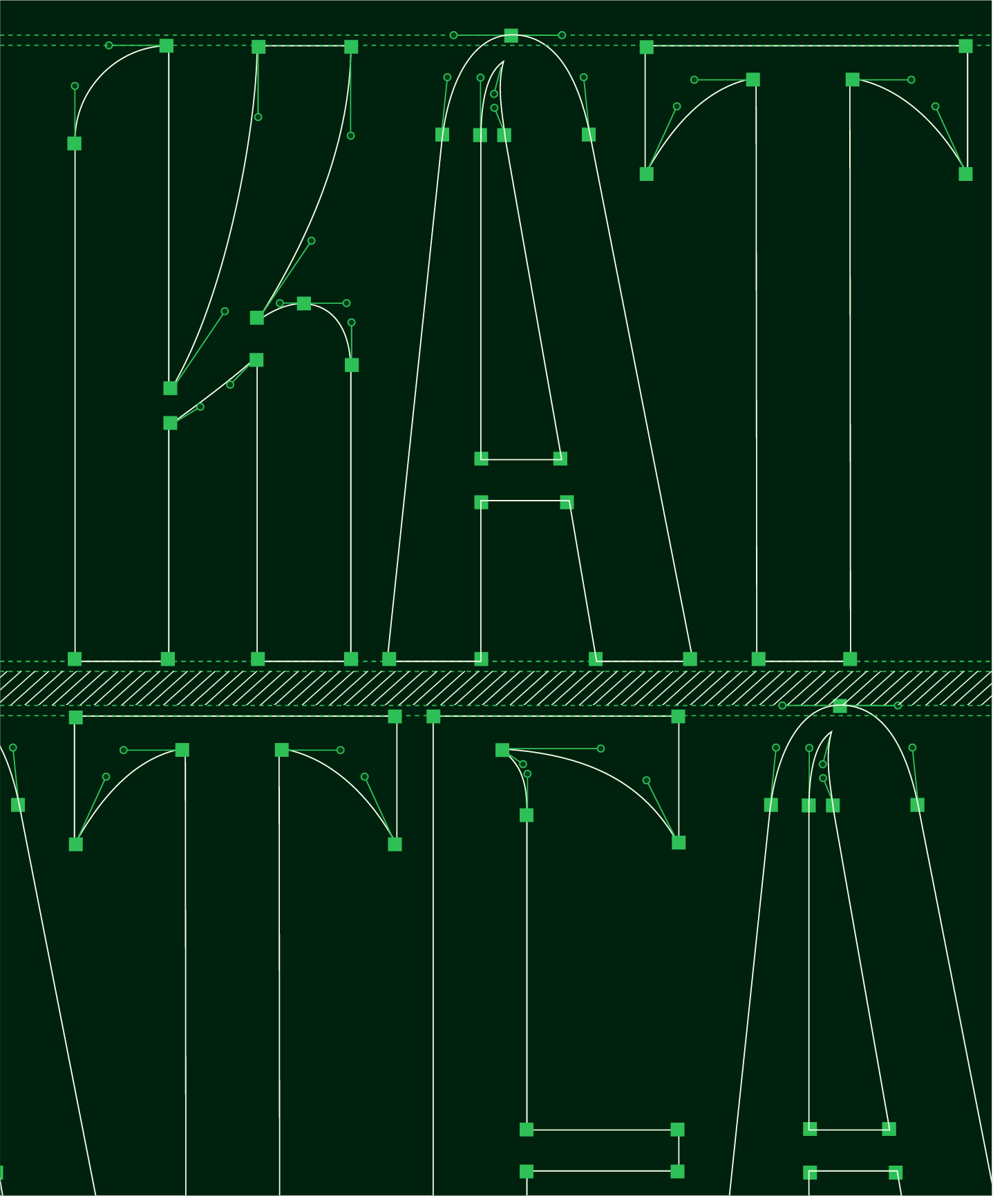
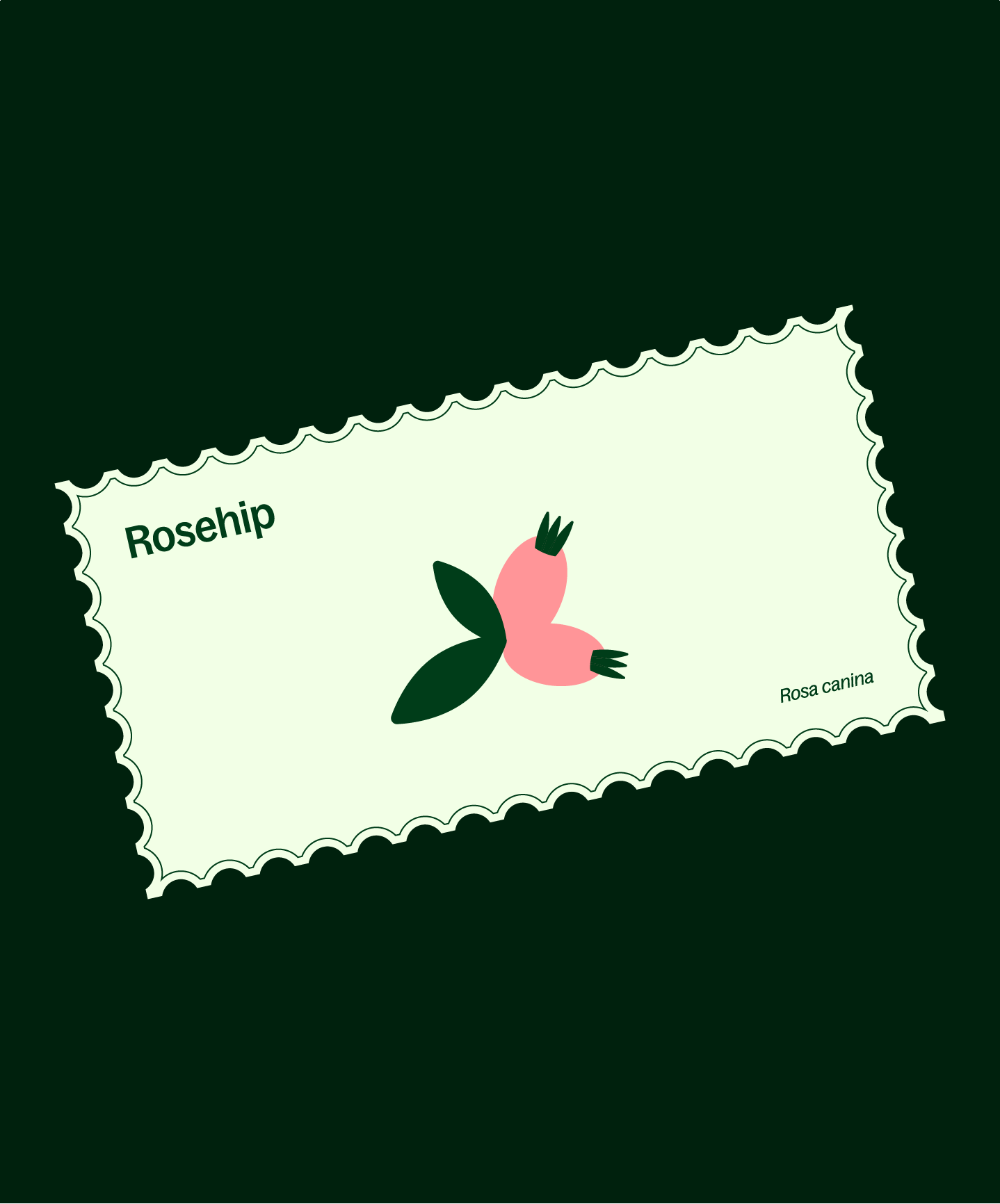
The custom typeface uses angled details that hint at leaves, stems, and natural motion, while bold illustrations build an entire herbal universe around it.
Playful and dynamic as always, the packaging system uses bold contrasts and expressive forms to stand out both on shelves and on screens.
A fresh, modern take on herbal wellness.
Designed at GoBIGNAME.